Utility Classes
Overview
As a part of the Perspective project, we have created a collection of utility classes that can be used to style components and screens in a very fast and consistent way.
Usage
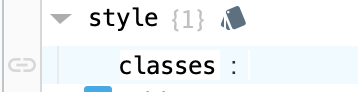
To use the utility classes, simply add the desired class to the style.classes property of the component you want to style. For example, to add a border to a component, you can add the border class to the style.classes property.
{
	"style.classes": "border"
}
Editing the Utility Classes
The utility classes are defined in the second half of the custom stylesheet. To edit them, simply open the stylesheet in the Designer and scroll down to the Utility Classes section. The classes are organized into sections similar to this documentation page, so you can easily find the class you want to edit.
Important: In the stylesheet, all custom classes to be used in perspective must start with the psc prefix. This is to avoid conflicts with any default classes that may be added in future versions of Perspective. However, the psc prefix is not required when adding the class to the style.classes property of a component.
If you make changes to the stylesheet, you will need to save the stylesheet and refresh the Designer (or close/reopen each view) to see the changes take effect.